
|
|
 03-02-2015, 06:43 PM
|
|
|
Rabbi Goldmann
Join Date: Nov 2012
Casino cash: $5450159
|
Another dumb Chiefs uni design
I don't even know why I'm posting this, feel free to blast away. This from 24-7 sports:
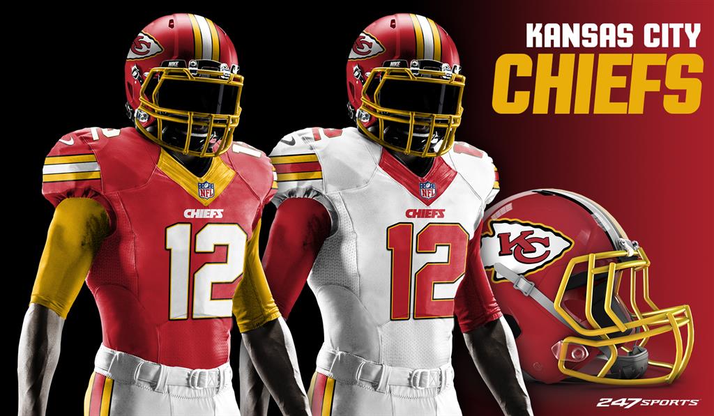 All that's missing from this Redskins ripoff is RGIII wearing it on the sidelines leaning on crutches. |
|
Posts: 87,025
  |

|
|
03-02-2015, 06:48 PM
|
#5 |
|
Veteran
Join Date: Jun 2005
Location: Olathe, KS
Casino cash: $10606233
|
Bollocks to both uniforms!
|
|
Posts: 3,774
|
|
|
03-02-2015, 06:57 PM
|
#7 |
|
NFL's #1 Ermines Fan
Join Date: Jul 2001
Location: My house
Casino cash: $2998491
|
Sometimes I think it would be cool if they just all went out there with cheap t-shirts in varying shades of red. A magenta shirt that has the name of a tire store on it, a blood red shirt with a faded picture of a vampire, and so on. Make it look like a pickup game.
__________________
I'm putting random letters here as a celebration of free speech: xigrakgrah misorojeq rkemeseit. |
|
Posts: 141,700
|
|
|
03-02-2015, 07:03 PM
|
#10 |
|
You gotta kill a few people
Join Date: Sep 2007
Casino cash: $1762369
|
Chiefs red is a great looking red.
The problem with these alternate unis is that whichever dipshit makes them always includes far too much yellow. It conjures up images of ketchup & mustard or Ronald McDonald. |
|
Posts: 44,478
|
|
|
03-02-2015, 07:11 PM
|
#12 |
|
Supporter
Join Date: Jan 2004
Location: Liberty
Casino cash: $1331251
|
More red, less Redskins.
|
|
Posts: 16,789
|
|
|
03-02-2015, 07:29 PM
|
#14 | |
|
Debunking your bullshit
Join Date: Aug 2002
Location: KC area
Casino cash: $4960315
|
Quote:
|
|
|
Posts: 52,592
|
|
|
03-02-2015, 07:31 PM
|
#15 |
|
Fifty eight sixty two...
Join Date: Jul 2005
Location: Felton, DE
Casino cash: $8467676
|
I suppose I could live with the uni, if I had to. I actually like the number font. It could even be rounded off more. In this day of computer-generated graphics, block numbers aren't really necessary.
But I will never accept a goddamn stripe on the helmet. Nope. |
|
Posts: 9,450
|
|


|
|
|


 Another dumb Chiefs uni design


 Linear Mode

